
Remedy earned its reputation one project at a time — but the brand behind it hadn’t caught up. We refined their identity and built a video-first website that finally does the work justice.
Remedy built a client list most video production companies would envy — major players like Amazon, Intel, Cisco, and Lyft alongside promising startups and indie artists. But their brand hadn’t kept pace with the work.
There was no centralized system tying it together, which meant every touchpoint, from the website to sales materials, told a slightly different story. The goal wasn’t a reinvention. It was elevation: Express who Remedy already was with the polish their resume and roster demanded.
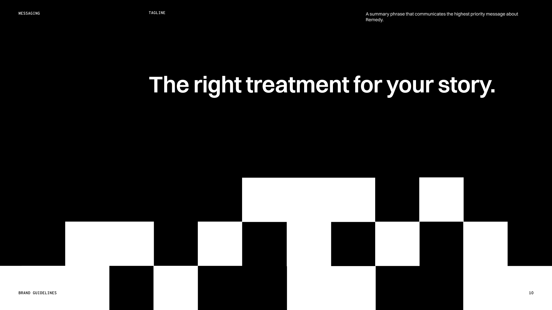
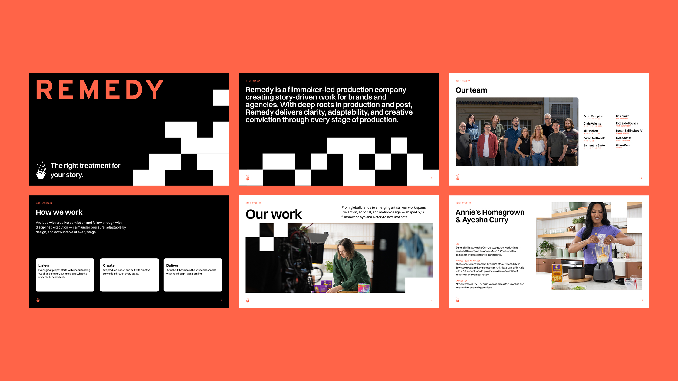
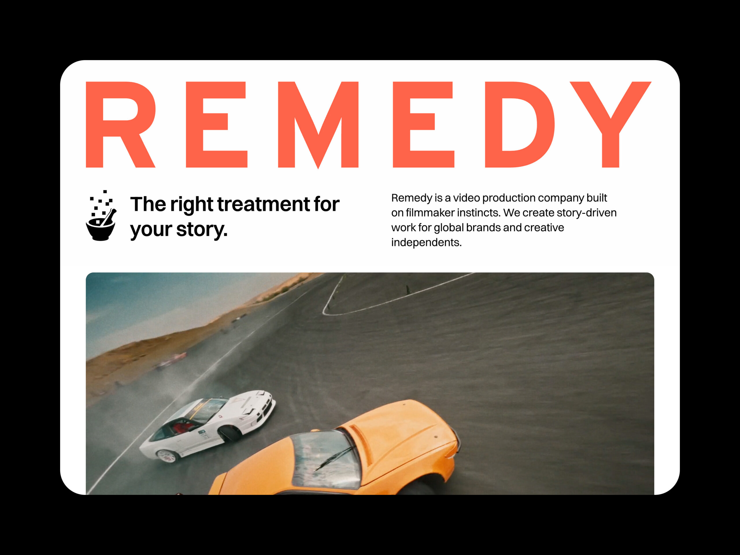
We sat down with the Remedy team to understand what they stood for, and the process behind what they made. Rather than revamping the logo or color palette, we refined and organized the existing brand into something more cohesive with a new verbal identity to match — “The right treatment for your story.”
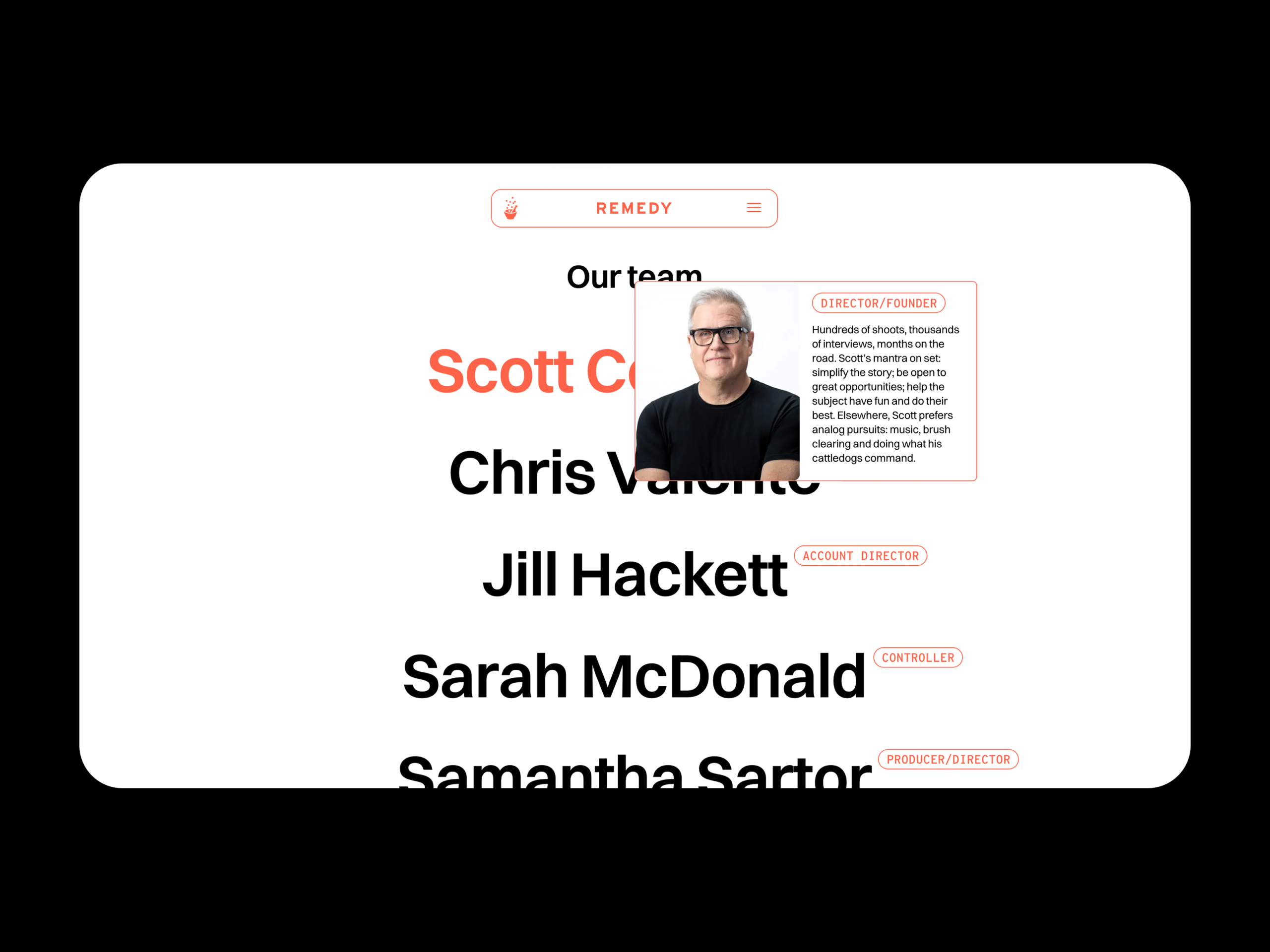
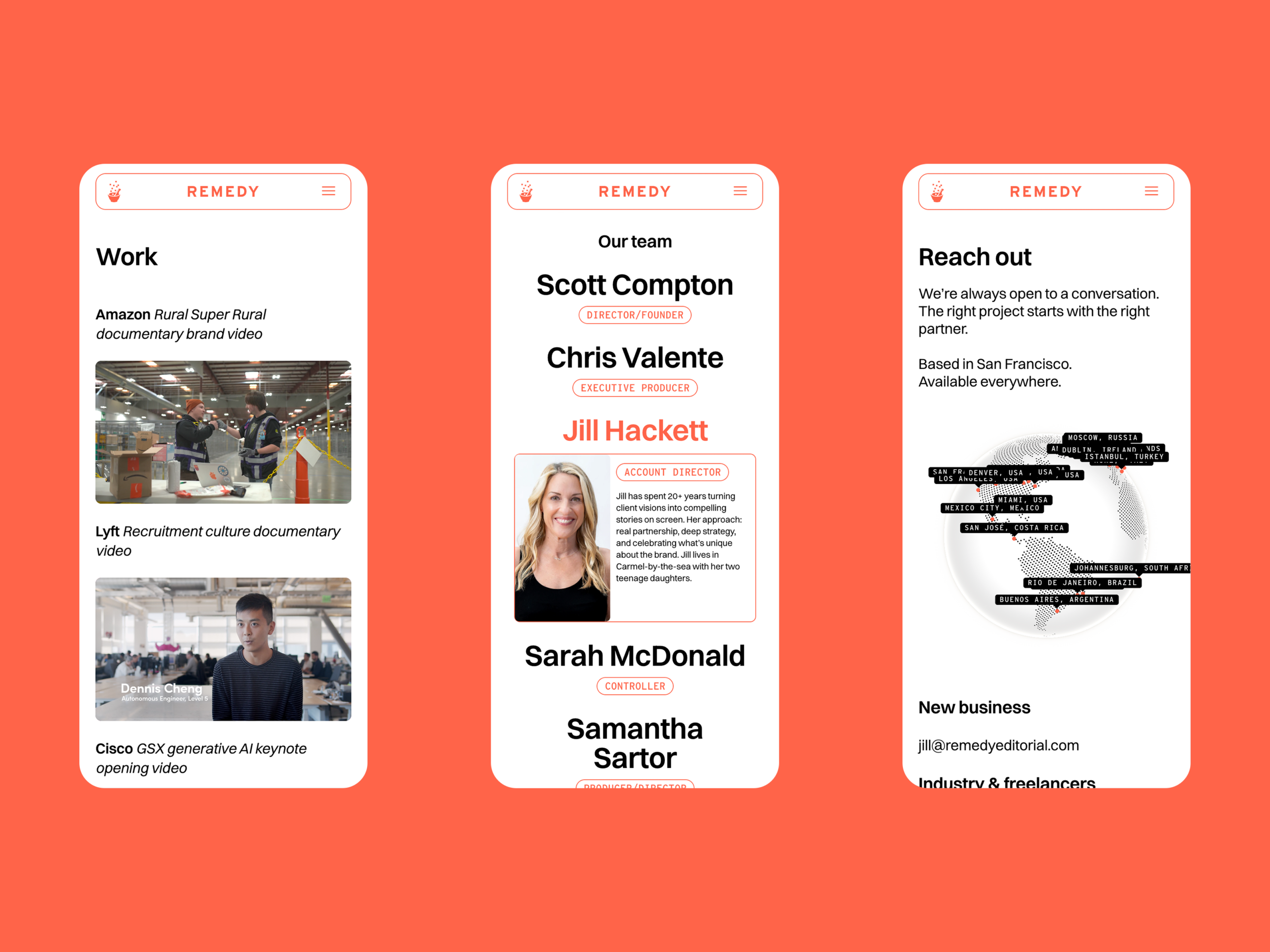
The website became the foundation for that refreshed identity — a modern, video-first experience that puts Remedy’s work front and center. Subtle page animations, autoplaying reels, an animated footer, and a playful interactive map add texture without distraction, all built fully responsive across desktop, tablet, and mobile.
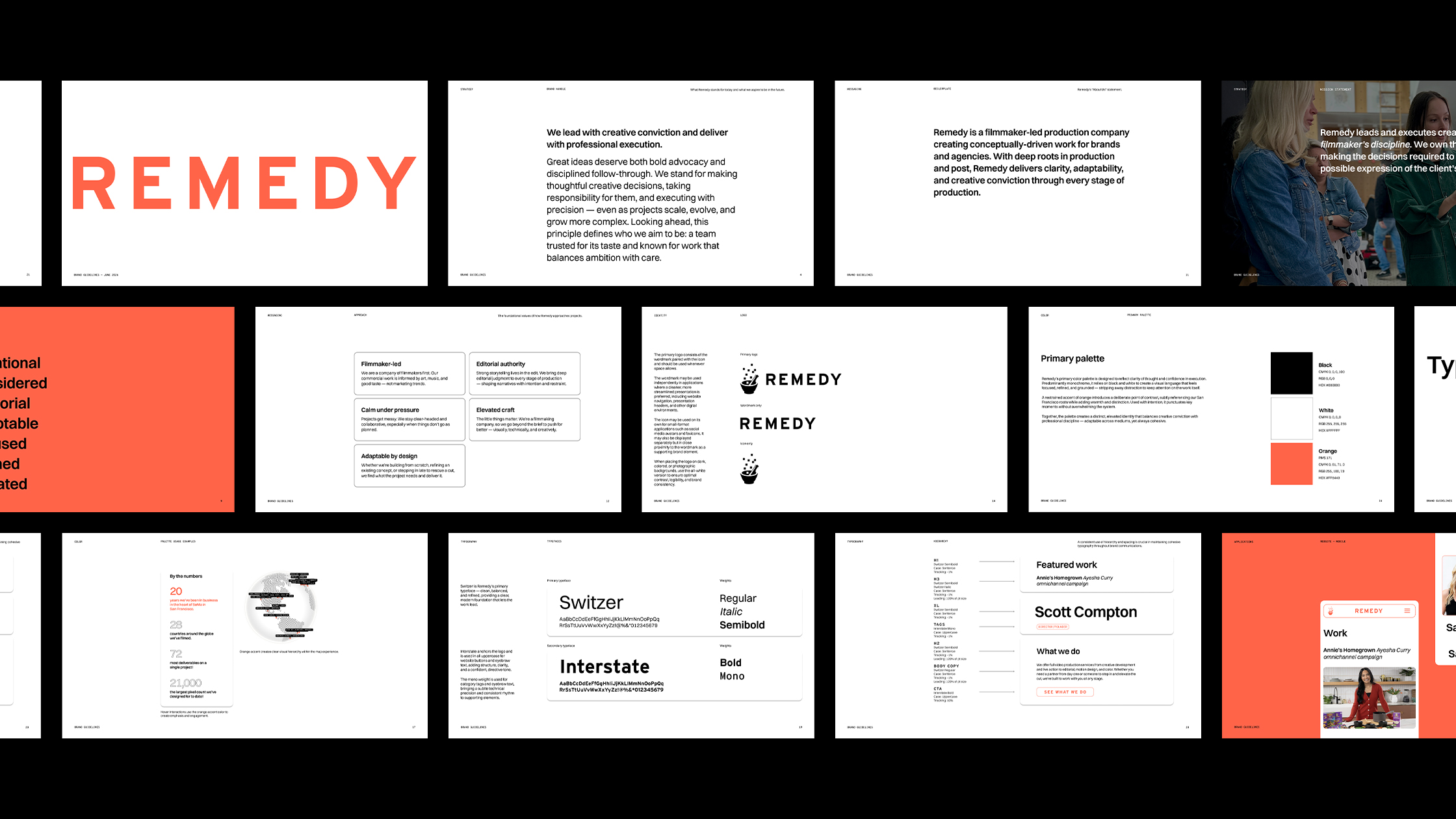
The new identity was later formalized into brand guidelines and extended into a new capabilities presentation, giving Remedy one cohesive system across every material.